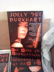
Or in other words, call upon the masters when you want it done right.
Instead of writing today, I decided I would try my hand at creating a flyer for The Rose of Shanhasson. I’m lining up a bunch of promo mailings for the print release in December, and the deadlines are fast approaching. Everything has to be done MONTHS in advance.
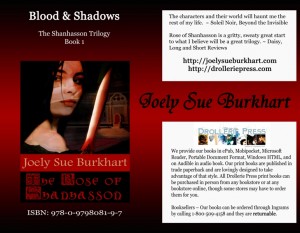
Printing all this stuff ain’t cheap by a long shot, so to save some money, I thought I’d create one myself. I had the VistaPrint template in hand, and I bought PhotoShop last year. I didn’t have to “create” new graphics — which I already know I can’t do after my class last year — just use what I already had at hand. And honestly, it wasn’t bad. A little blocky and too symmetrical, but not bad. I did a gradient in the background, added the cover, the DP logo, a few reviews…
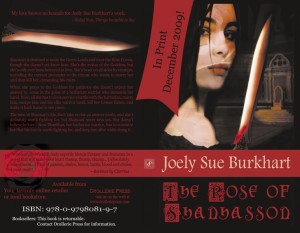
But it didn’t have that magic I was hoping for. Hey, this is my FIRST print release. I want it done right. So I sent it to Deena, the mastermind behind most of Drollerie’s incredibly unique and beautiful cover art. Bless her creative little heart, she took the cover flat and whipped up a very attractive flyer. It looks like art, not like an inexperienced person trying to use PhotoShop! I hated adding another thing to her light-year-long list of to-dos, but wow, she does gorgeous work.
So the VistaPrint order has been placed for 100 flyers. If I didn’t screw anything up in the upload and everything looks good, I’ll order a ton more and get ready for the first mailing.
Okay, so here’s the difference between an amatuer PhotoShopper (mine on the left) and a professional (Deena’s on the right). Click for larger version.


 Stop by Stella’s